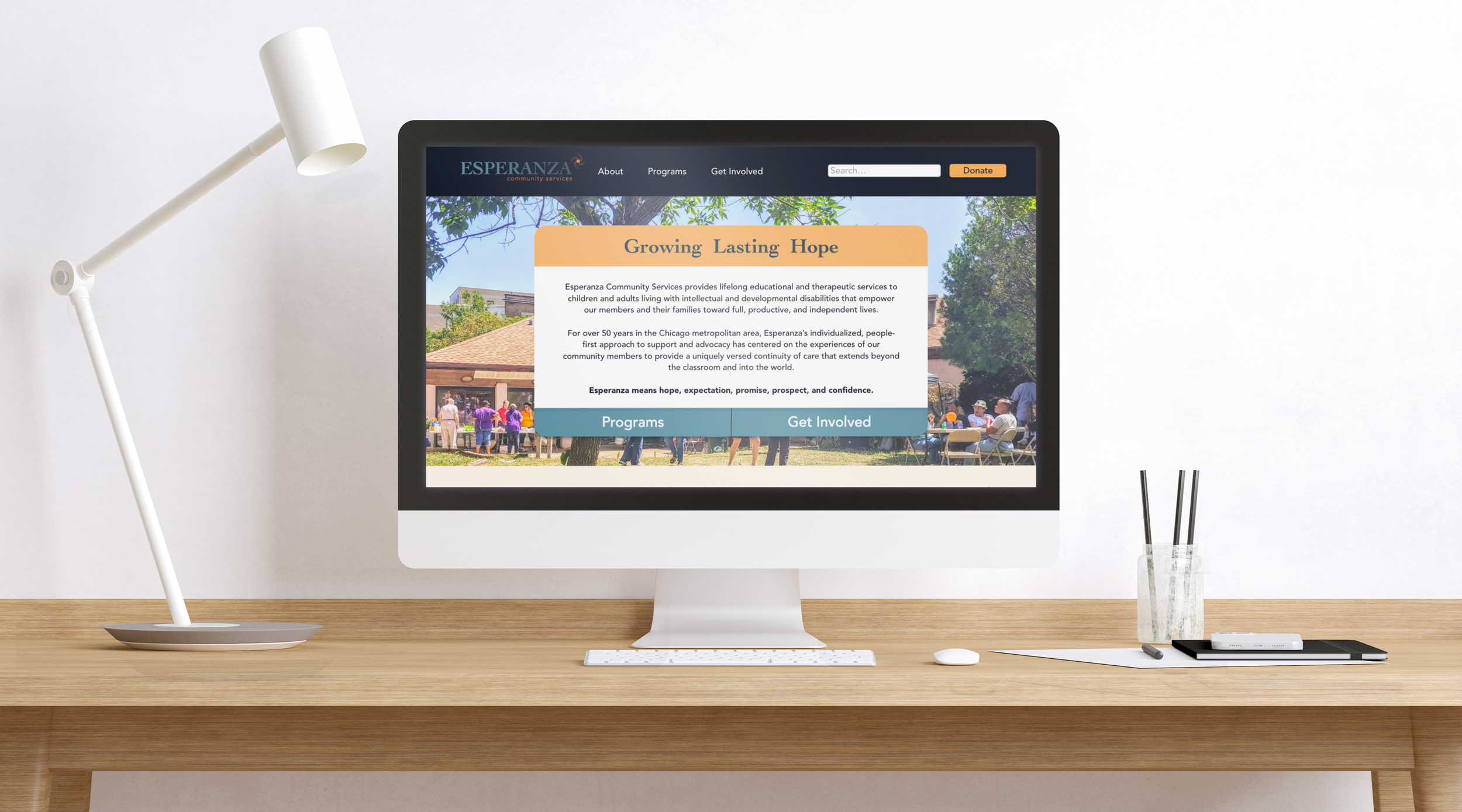
Esperanza Community Services
Redesign
Read More ↓
Esperanza Community Services is a non-profit organization based in Chicago who aims to support special education students by providing educational programs that focus on specialized concentrations and encouraging independence.
Role
UI/UX
Brand Identity
Project Management
Digital Production
Tools
Miro
Adobe Illustrator
Adobe XD
Duration
2.5 months
Team
Three collaborators
Esperanza’s website at the time of this project
The Problem
Esperanza Community Services’s website navigation is confusing, hindering users from efficiently accessing relevant information. Additionally, the home page lacks clear and intuitive calls to action, creating a user experience that may lead to frustration and reduced engagement. Lastly, the branding elements appear outdated, potentially diminishing the organization's overall image and effectiveness in conveying its mission.
The Goal
Our objective is to revitalize Esperanza Community Services' online presence by developing a modernized brand identity, encompassing logo design and a contemporary color palette. Subsequently, we will leverage this revitalized brand to create a visually appealing mockup for the home page and propose website enhancements, focusing on improving user experience and increasing engagement on high-priority call to actions.
Step 1. Research
In order to better understand the client’s ask, the team facilitated a few workshop activities to learn what they would like to highlight in their new branding. At the end of the workshop, my team and the client agreed on the main priorities: increase brand awareness and engagement on the website.
As UI designer, I conducted preliminary research by taking a look at the information architecture and redesigning the site map and content outline of the current website. The main issues I found with the current site map were the subpages of the “About” and “Update” sections. The “About” section mostly included ways to get involved with the organization, while the Updates section was confusing and lacked important, frequent updates for users.
Original site map
After my audit, I suggested a reorganized site map for easier navigation on their website. For example, I moved the “About” subpages to be under a revised “Get Involved” page, replacing the outdated Updates page. This streamlines users looking for direct engagement with Esperanza and users looking for general information in the About page.
Suggested site map
Step 2. Wireframes
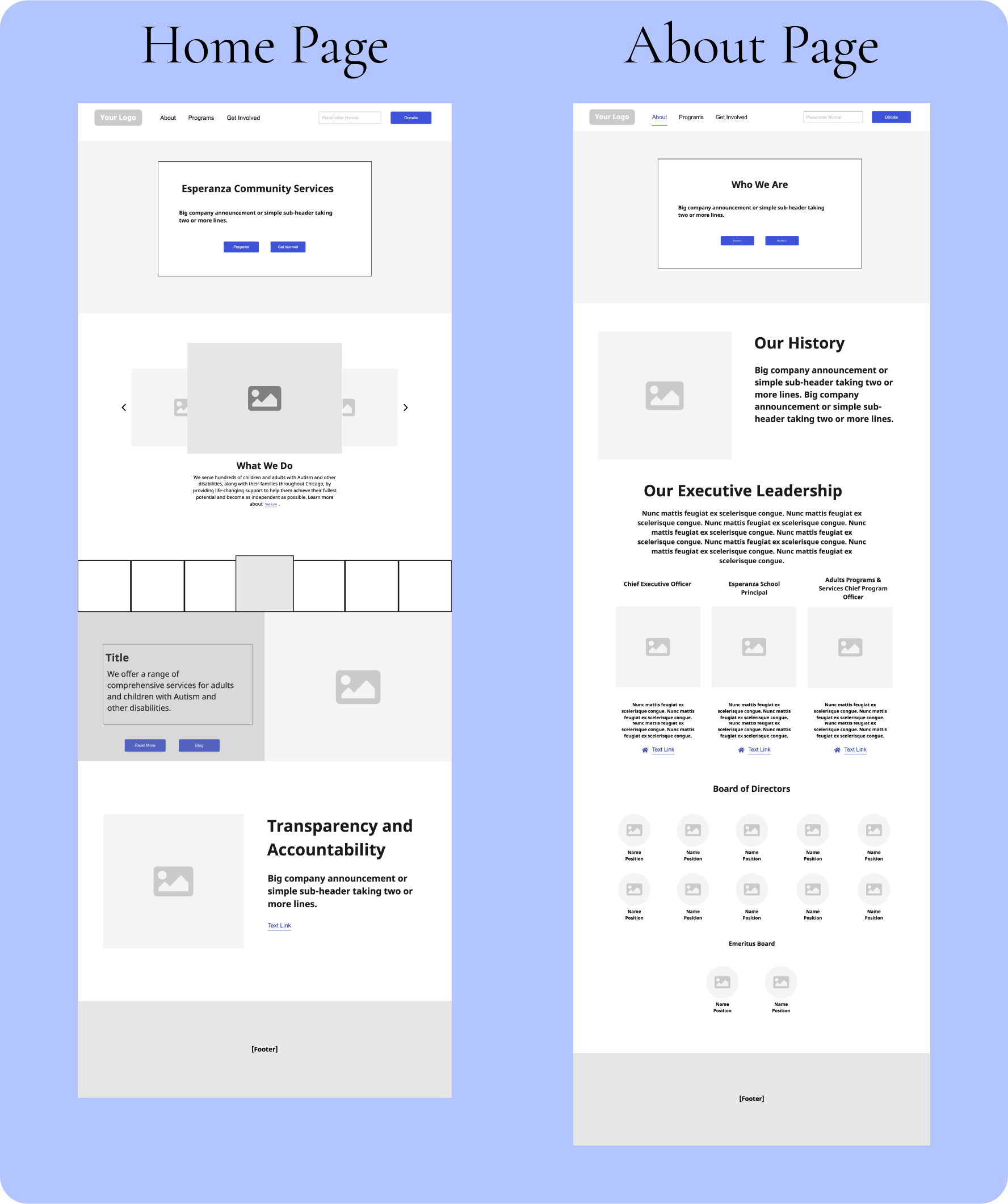
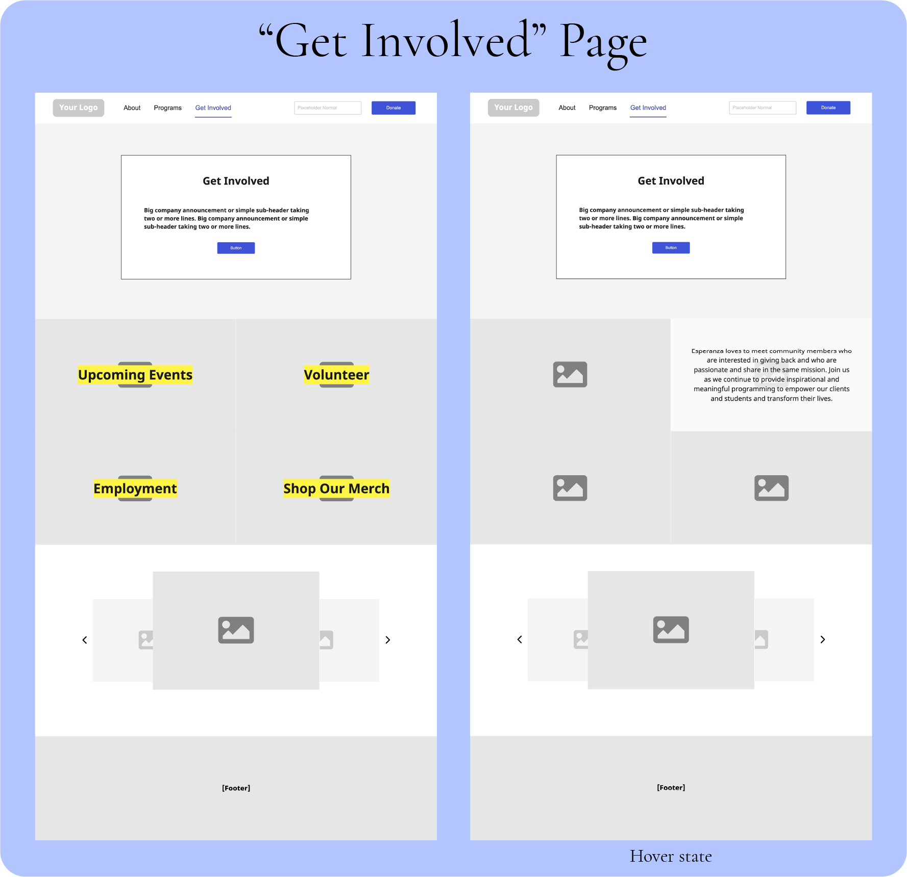
After receiving approval from the client on the revised site map, I worked on low-fidelity, individual page wireframes to supplement the recommendation. I kept in mind the call to actions on each page, the information hierarchy, and consistency across the board.
Step 3. Mockups
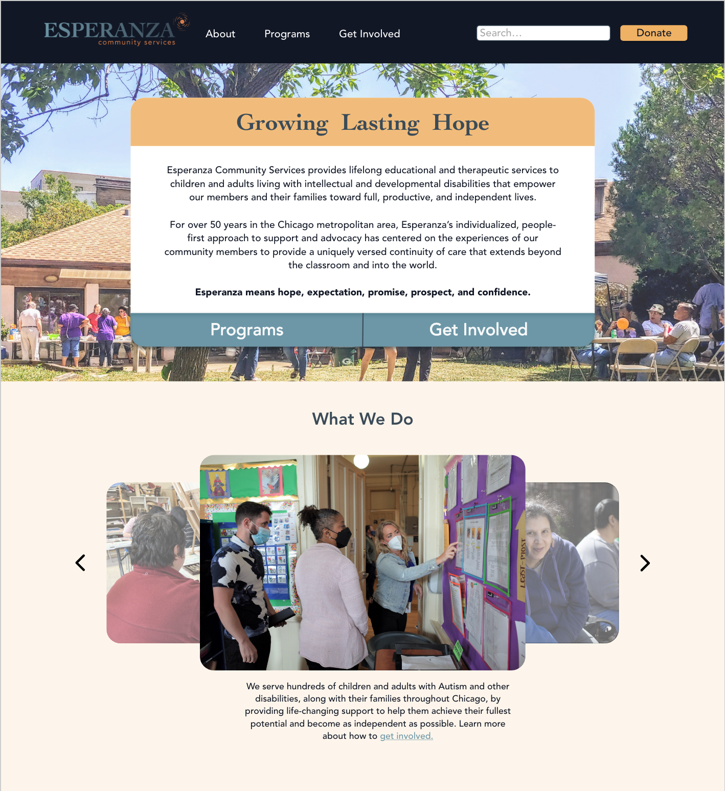
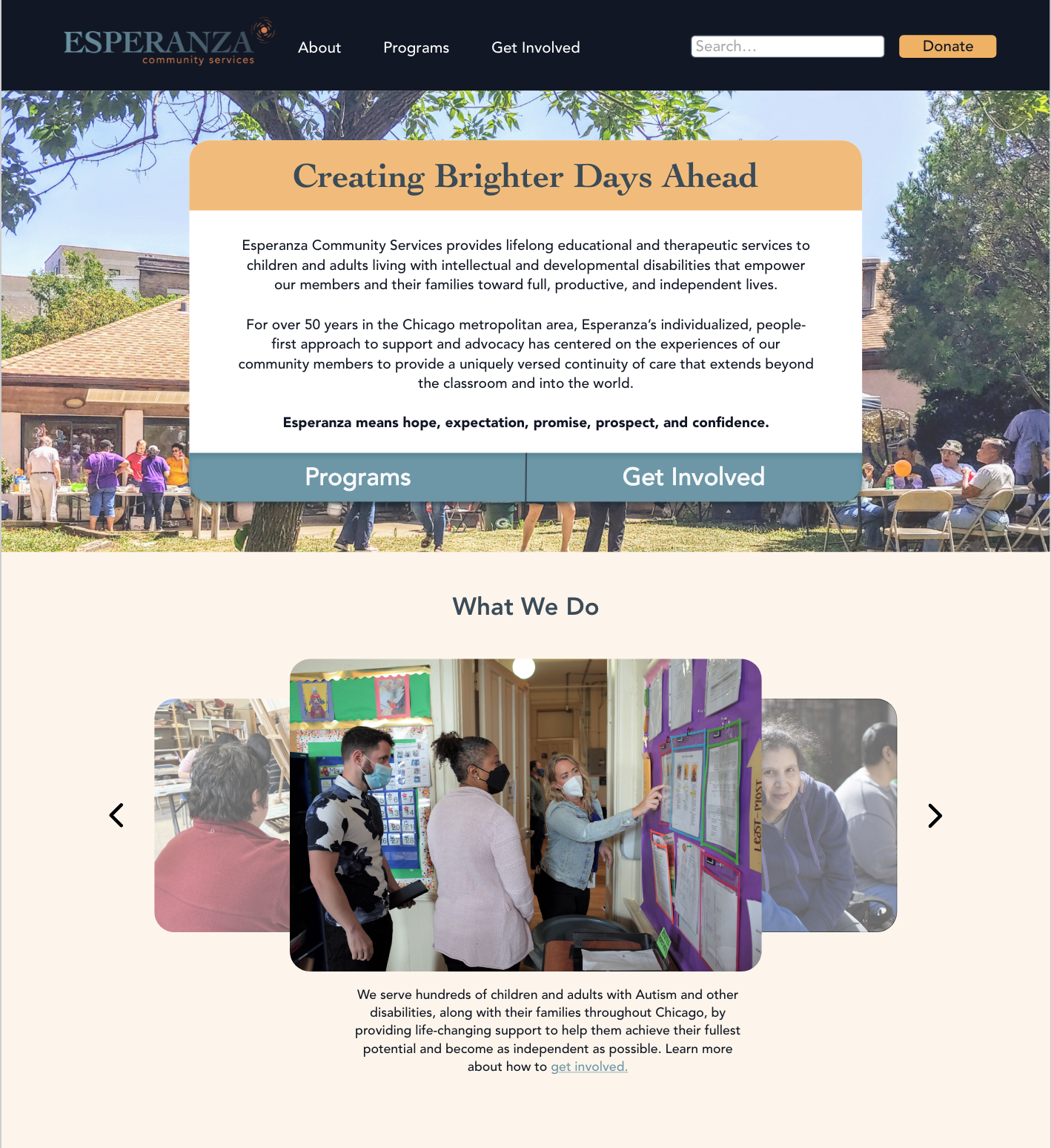
Lastly, I designed two final mockups in Adobe XD for the website’s landing page, including my team’s new logo and branding while showcasing two possible tag lines and mission statements. I placed Programs and Get Involved buttons on the front of the landing page and increased the overall number of CTAs throughout the website to increase user engagement. I also utilized more candid photos while delivering information as a way to convey the brand’s significant presence in the greater Chicago area.
Overall, the client was pleased with the results and was able to move forward with website restructuring and rebranding after the project handoff.


